Car dashboards show more data than ever, but not every number deserves the same attention. The useful approach is to group information by urgency.
Safety warnings come first, maintenance signals come next, and efficiency data is most useful when interpreted over time.
Warning Lights Need Context
Red warnings usually mean stop or act immediately. Amber warnings usually mean check soon. Informational icons may only confirm that a system is active.
The owner manual is still the authority, but a visual warning map helps drivers recognize what needs attention first.
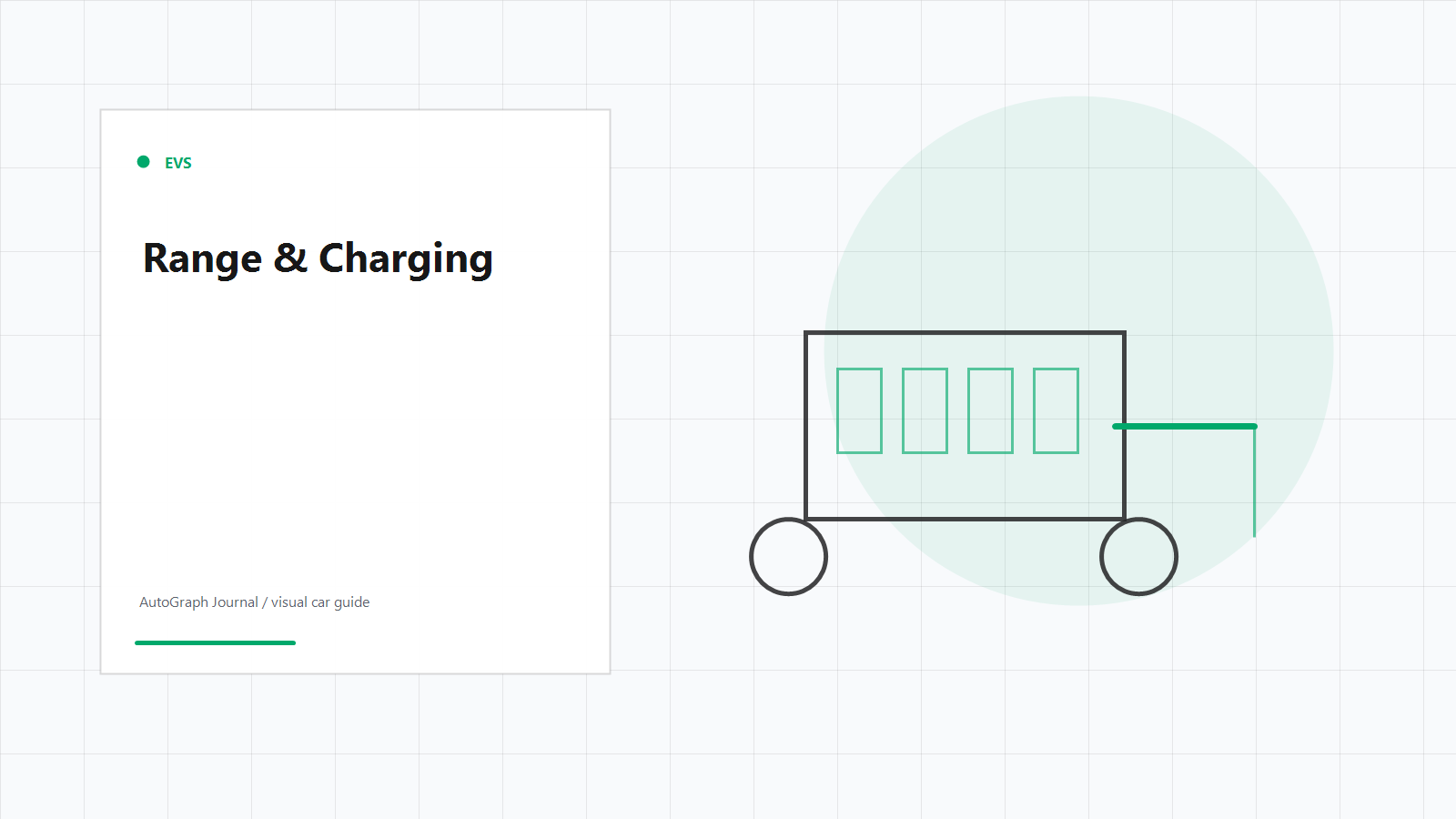
Range Is an Estimate
Fuel range and EV range are predictions based on recent use, current conditions, and available energy. They can change quickly with speed, weather, load, and terrain.
Treat range as a planning signal, not a promise.
Tire Pressure Affects Safety and Cost
Low tire pressure can reduce control, increase wear, and hurt fuel economy. A dashboard warning should trigger a physical pressure check, not just a reset.
Pressure should be checked when tires are cold for the most accurate reading.
Efficiency Data Works Best as a Trend
Instant fuel economy or energy use can jump around. Trip averages are more useful for understanding driving style, route, and vehicle health.
The best dashboard data is the data that changes behavior before a problem becomes expensive.